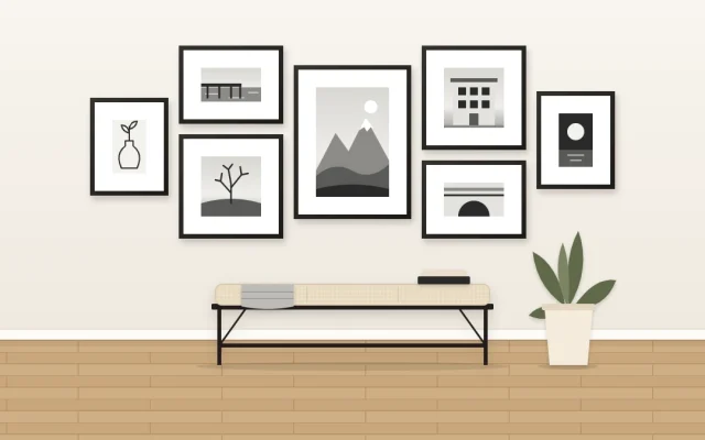
Photo Gallery Wall Ideas: Displaying Your Own Pictures Well
Turn personal photos into a coherent wall display: edit to a theme, mix scenes, details and portraits, unify them with one treatment and matching mats, then try a timeline row, a travel cluster or a hero print.
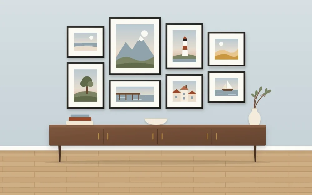
Your camera roll holds thousands of pictures, and that is the problem. A photo gallery wall rarely fails because of the frames or the layout. It fails because too many photos made it onto the wall, and nothing connects them except that you took them.
So the work begins well before anything goes on the wall. Edit hard, give the survivors something in common, and then choose a display idea that fits the story they tell.
Edit first: choose a theme and leave most photos out
A wall with a subject is easier to look at than a wall of everything. Pick one thread before you open your photo library.
- A period: one year, the first year in a new home, a childhood decade by decade.
- A place: one trip, one coastline, the town you grew up in.
- People: one family across generations, or the same faces over time.
- Everyday life: the kitchen table, the garden, the dog, the walk to school.
Then narrow it down in rounds.
- Gather every photo that fits the theme into one album. Expect far too many.
- Cut near-duplicates. Keep one from each moment.
- Cut anything you kept out of duty instead of affection.
- Stop at roughly twice the number of frames you plan to use, and view those side by side on one screen.
- Choose the final set as a group, not one by one. A good photo that does not sit with the others stays in the album.
Leaving a photo off the wall does not erase it. Albums and photo books are there for the rest.
Mix wide scenes, details and portraits
Ten photos taken from the same distance blur into one another, however good each is. Variety of scale keeps the eye moving. Aim for a blend of three kinds:
- Wide scenes that show where you were: a beach, a street, a hillside.
- Details that carry the texture of the memory: hands, a doorway, a plate of food, a pair of boots.
- Portraits, posed or caught, where a face is the subject.
For a wall of eight, something like three scenes, three details and two portraits gives a comfortable rhythm. Too many faces at once can feel like being watched, so let quieter pictures sit between them.
Make different photos belong together
Photos taken years apart, in different light, look unrelated until you give them shared features. Three do the most.
One treatment
Decide whether the wall is all color, all black and white, or all in one warm, slightly faded look, and apply that choice to every picture. Mixing treatments is the quickest way to make a display look accidental. Black and white is especially good at uniting mismatched photos, because it removes clashing colors; the guide to a black and white gallery wall covers that look in depth.
Matching mats
Use the same mat color throughout, usually white or off-white. Mats also let you place photos of different sizes inside frames of the same size.
A consistent frame style
Personal photos are busy with life already, so frames can stay simple. One slim style in one finish keeps attention on the pictures. If you are weighing up a full set, see when one frame style works best.
Print sizes and mats in general terms
Size tells the viewer what matters. Print your strongest one or two photos clearly larger than the rest, and let the others step down. Scenes with distance and sky cope well with being large; tight details and snapshots often look better small with a wide mat.
Before ordering, check how each file looks at the size you want. A picture from an old phone or a scan of a small print may turn soft when enlarged, and is better kept small. A wide mat around a small print gives it presence without stretching it.
Mix orientations as well. A wall of only landscape shapes reads as stripes, and only portrait shapes as a fence. Combining both, with a square or two, makes the outline of the group easier to balance. Just keep the photos themselves uncropped where cropping would cut off what you love about them.
Three display ideas for personal photos
A timeline row
Arrange photos in date order along a single line: one per year, one per school year, one per home. A row suits long, narrow spaces and gets read like a sentence as people walk past, which makes it a natural choice for a hallway gallery wall. The same idea can climb with the steps; the guide to a staircase gallery wall explains how to make the line rise evenly. Stairs are awkward to work over, so plan on a helper or a professional installer for the higher sections.
A travel cluster
Group the photos from one trip, or one photo from each of several trips, in a loose cluster. Put a wide scene near the middle and details around it. Flat keepsakes you own, such as a ticket, a pressed leaf or a paper map of the area, can take a frame of their own among the photos.
One hero print with supporting pictures
Choose the single photo you would save first and print it large. Arrange four to six small prints from the same story on one side or around it. The big print carries the wall from a distance, and the small ones reward anyone who comes close.
Leave a slot to swap
Life keeps producing photos, and a wall that cannot take a new one soon feels dated. Build in room for change from the start.
- Choose one or two frames that open easily at the back, and treat them as rotating slots.
- Keep the prints for those slots the same size, so a new picture fits the existing mat.
- Store earlier prints flat behind the current one in the same frame.
- Leave space at one edge of the arrangement for a future frame.
Before you hang anything
Choose mounting hardware for your wall type and the weight of each frame, and follow the hardware manufacturer’s instructions. Keep irreplaceable original prints out of strong direct sun, and frame a copy instead where you can.
Frequently asked questions
How many photos should a photo gallery wall have?
Fewer than you expect. Five to nine well-chosen photos usually make a stronger display than twenty, because each one gets noticed. Let the wall and the theme set the number, begin with a small group, and leave space at one edge so another frame can join later.
Should the photos be color or black and white?
Either works as long as you choose one and stay with it across the whole wall. Black and white is helpful when your photos come from different years and lighting, since it removes clashing colors. Color suits a set that already shares a palette, such as one trip or one season.
How do I choose which family photos to display?
Pick a theme first, such as one decade or one branch of the family, then gather everything that fits and cut in rounds. Remove near-duplicates, keep a mix of wide views, close details and faces, and judge the final set together on one screen instead of picture by picture.