Black and White Gallery Wall: A Timeless Look for Photos and Prints
How to build a monochrome display that looks crisp instead of cold: choosing pictures with a full range of tones, picking frames and mats, matching the grays and warming up the setting.
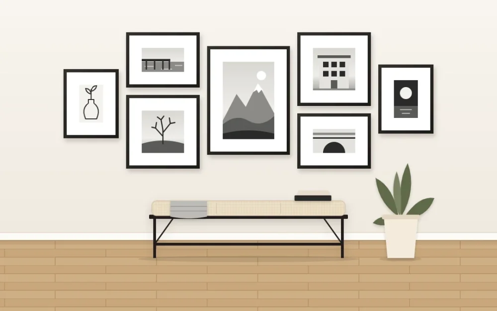
Take the color out of a group of pictures and something useful happens: a beach snapshot, a pencil sketch and a print of a city street suddenly look as if they were chosen together. That is the appeal of a black and white gallery wall. It gives unrelated pieces a shared language, so the arrangement reads as one composition instead of several separate things.
The risk is the opposite of clutter. A monochrome wall can come out cold, flat or a little like an office corridor. The fixes are simple, and most of them are decided before a single frame goes up: the tones inside the pictures, the frames and mats around them, and what the wall sits next to.
Why monochrome pulls a mixed set together
Color is usually the loudest difference between two pictures. A red jacket in one and a turquoise sea in the next will compete, however carefully you arrange them. Remove the color and what remains is shape, light and texture, which sit side by side far more easily.
That makes monochrome images a practical choice for sets gathered over many years, from different places, on different paper. If you are still deciding which of your own pictures deserve wall space, start with the guide to editing personal photos into a coherent display, then come back to the tonal choices here.
Choose pictures with light, middle and dark tones
A flat monochrome wall is nearly always a wall of middle grays. Each picture looks fine alone, but together they blur into one soft band. Before you commit to a set, lay the pieces on the floor and check them as a group.
- Light: at least a few pieces with real brightness, such as an open sky, snow, a white wall or bare paper around a drawing.
- Dark: two or three pieces with deep shadow or a solid black shape, spread apart so they do not pool in one corner.
- Middle: the rest, with visible texture such as bark, stone, fabric or water.
Squint at the group. If everything merges into one gray block, swap a mid-tone picture for something brighter or darker. If one piece jumps out as a black hole, move it toward the center or pair it with a second dark piece on the other side.
Mix photographs with drawings and graphic prints
Photographs alone can feel heavy, because most of them fill the paper from edge to edge with tone. Pieces that leave a lot of white paper showing lighten the wall and give the eye places to rest.
Good partners for photos include a line drawing in ink or pencil, a simple graphic print built from a few solid shapes, a pressed fern or leaf on white paper, and a child’s drawing made in black marker. Use your own work, pieces bought from the person who made them, or public-domain images.
A rough balance to try is two photographs for every drawing or print. Scatter the lighter pieces through the arrangement so they break up the darker ones instead of forming a pale cluster of their own.
Frames: black, white, or one warm wood
The frame finish decides whether the wall feels sharp or soft. Three options cover most rooms.
| Frame finish | Effect on the wall | Works well when |
|---|---|---|
| Black | Crisp outlines; every piece becomes a clear rectangle | The wall is pale and you want a graphic, defined look |
| White | Frames recede; the pictures seem to float | The pictures are dark or busy, or the room is small |
| Pale or mid-tone wood | Adds warmth without adding a color | The room has wood furniture and the look risks feeling stark |
Choosing one finish for the whole set is the simplest route, and it suits this look especially well. The article on using one frame style across a whole gallery wall explains how to pick the profile and keep a matched set from looking flat. If you prefer to mix, limit yourself to two finishes, for example mostly black with two or three wood frames spread across the group.
Give the pictures wide white mats
A wide mat does two jobs on a monochrome wall. It adds brightness around a dark picture, and it makes a small print feel considered instead of lost. A modest photograph with a generous border around it often has more presence than a larger print pushed right up to the frame edge.
Keep the mat color consistent. Bright white next to cream makes the cream look dirty, so pick one white and use it throughout. Check the mats against the paper of your prints too, since a warm paper inside a cool white mat can look yellowed.
Make the grays match
Black and white is not one thing. Some prints lean cool and bluish, some are neutral, and some are warm, close to sepia. Mixed at random, they look like an accident.
When you convert color photos, apply the same treatment to every picture in the set and have them printed together, on the same paper with the same surface finish. One deliberately warm piece among neutral ones can work as a feature. Three or four slightly different grays just look mismatched.
Warm it up with what surrounds it
Most of the warmth in a monochrome display comes from outside the frames. A wood bench or console below, a plant beside it, a wool throw or a linen cushion nearby all stop the wall from feeling clinical.
Wall color matters as well. White and warm white keep the look fresh, soft gray makes it quieter, and a deep charcoal turns white mats into bright windows. Muted colors such as sage or clay work too, because the pictures bring no color of their own to clash with. If you find you prefer a gentler, tonal version of this look, the guide to soft neutral gallery walls takes that direction.
Tip
One small accent of color is an option, not an obligation. A single piece with a touch of ochre or deep green, placed off-center, can make the grays around it look richer. Stop at one, or the wall is no longer monochrome.
Before you hang anything
Choose mounting hardware to suit your wall type and the weight of each frame, and follow the hardware manufacturer’s instructions. For large glazed frames, ask someone to help if you are unsure.
Frequently asked questions
Do all the frames need to be black on a black and white gallery wall?
No. Black frames give the sharpest outlines, but white frames suit dark or busy pictures and small rooms, and pale wood adds warmth. What helps most is restraint: one finish throughout, or two finishes with each repeated several times across the arrangement so the mix looks intended.
Can I mix black and white photos with color pictures?
You can add one small piece with a single muted color as an accent, placed away from the edge of the group. More than that and the display stops reading as monochrome. If you want several color pieces, plan a wall around a limited color palette instead and let the monochrome pictures play a supporting role.
What wall color suits a black and white gallery wall?
White and warm white keep it fresh, soft gray makes it calmer, and a deep charcoal lets white mats stand out strongly. Muted colors such as sage or clay also work, because grayscale pictures do not compete with them. Hold a matted frame against the wall in daylight before deciding.