Colorful Gallery Wall: Using Bold Color Without the Clutter
Six ways a bright wall goes wrong and how to fix each one: set a palette of three or four hues, vary the intensity, quiet the frames, spread the boldest pieces and tie one color to the room.
Color is the reason some walls make you smile from the doorway, and it is also the reason some of them are tiring to sit beside. The difference is almost never the amount of color. A colorful gallery wall looks lively and deliberate when the color is organized, and noisy when every piece arrives with a palette of its own.
So this guide works as a set of diagnoses. Each section names a way a bright wall goes wrong, explains what causes it and gives a fix you can try with the pieces laid out on the floor before anything goes up.
Problem: every piece is a different color story
Why it happens: the pieces were chosen one at a time, each because it looked good alone.
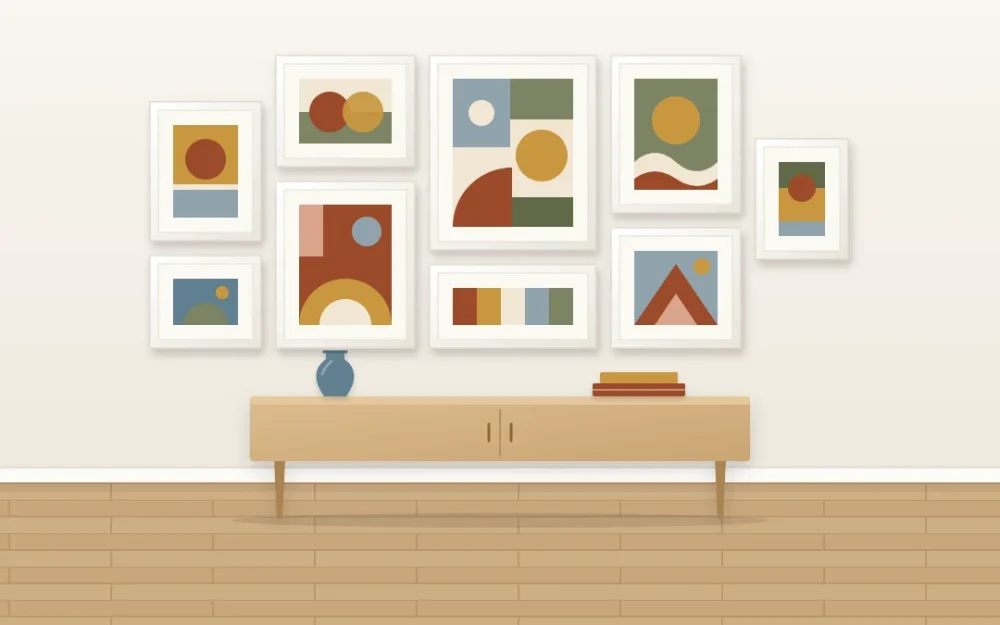
The fix: set a palette of three or four hues for the whole wall, for example clay red, ochre, dusty blue and olive. Every piece has to contain at least one of them. Pieces may include other colors in small amounts, but the palette colors should dominate.
Then count. Each hue should appear in at least three pieces. A color that shows up once looks like a stray; the same color seen three times across the wall looks like a decision. If you are still choosing what to frame, the guide to selecting art that belongs together explains how a color family can act as the thread for a whole collection.
Problem: everything is shouting at the same volume
Why it happens: every piece is fully saturated, so nothing leads and nothing rests.
The fix: vary the intensity, not just the hue. On a wall of nine pieces, a mix along these lines keeps the energy without the glare:
- Two or three saturated pieces that carry the wall.
- Four or five mid-tone pieces in softer or dustier versions of the same hues.
- Two neutral pieces, such as a line drawing on cream paper or a pale tonal abstract, where the eye can pause.
The neutral pieces are not a compromise. They are what makes the bright ones look bright.
Problem: the frames compete with the art
Why it happens: colored frames around colorful art double the number of colors on the wall, and each frame edge becomes one more thing to look at.
The fix: choose one side to be loud. The two approaches compare like this.
| Approach | What it looks like | Suits |
|---|---|---|
| Quiet frames, strong art | White, black or pale wood frames with white mats that contain each piece | Bold abstracts, saturated prints, a varied collection |
| Colored frames, calm art | Frames painted in two or three palette hues around line drawings, monochrome photos or pale prints | Simple art, children’s rooms, a playful hallway |
Doing both at once rarely works. If you want a single colored frame among quiet ones as an accent, match it to a hue already in the palette. The article on frame finishes and how they combine covers the neutral options in detail.
Tip
A wide white mat works like a pause between a strong picture and its neighbors. If two bold pieces clash side by side, try giving one of them a larger mat before you give up on the pairing.
Problem: the brightest pieces have clumped together
Why it happens: favorites get hung first and next to each other, usually in the middle.
The fix: spread the saturated pieces so there is at least one calmer piece between any two of them. Placing them in a loose zigzag or triangle across the arrangement leads the eye around the whole wall instead of pinning it to one corner.
Do the same for each hue. If all the blue is on the left, the wall splits into a blue half and a red half. Move one blue piece to the far side and the two halves join up.
Problem: the wall has nothing to do with the room
Why it happens: the palette was chosen from the art alone, so the display looks as though it was moved in from another house.
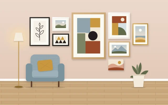
The fix: link one hue to something that already exists nearby. A blue vase on the console below, a rust cushion on the chair beside it or an olive throw is enough. One link is plenty. Matching every color to an accessory makes the room look staged.
If the room is mostly neutral, the wall can be the single strong moment in it, and a lone object in a palette color keeps it from feeling isolated.
Problem: the colors fight instead of sitting together
Why it happens: the hues are all equally strong and unrelated, so each pair vibrates.
The fix: use the color wheel loosely, as a way to find pairs that sit well together.
- Neighbors on the wheel, such as yellow, orange and red, blend easily and feel warm and harmonious.
- Opposites, such as blue and orange, make each other look stronger. Let one lead and the other appear in smaller amounts.
- Muted versions of almost any hues are easier to combine than pure ones. Clay sits beside olive more comfortably than bright red beside bright green.
A dependable palette is two or three neighbors plus one opposite used sparingly as the accent.
Option: put color behind the display
A painted wall changes how the pieces behave. On white, each picture is a separate bright spot. On a deep or mid-tone wall, white mats and pale frames stand forward and the art looks more contained, which can calm a busy set.
Pick a wall color that is a quieter relative of one palette hue, such as a soft sage behind art with olive in it. Avoid a wall as saturated as the art, or the pieces lose their edges.
Keeping a bright wall fresh
A fixed palette makes swapping easy: any new piece that carries the palette hues can replace an old one without disturbing the rest. That is useful if you like change through the year. The guide to rotating art with the seasons shows how to set up a few swap frames for it.
Before you hang anything
Choose mounting hardware to suit your wall type and the weight of each frame, and follow the hardware manufacturer’s instructions.
Frequently asked questions
How many colors should a colorful gallery wall have?
Three or four main hues is a manageable number for most walls. That is enough variety to feel lively and few enough that each color can appear in several pieces. Other colors can show up in small amounts inside individual pictures, as long as the main hues clearly dominate the group.
Should I use colored frames or plain ones with bright art?
Plain frames in white, black or pale wood usually serve bright art best, because they contain each piece without adding more color. Colored frames suit calm art such as line drawings or monochrome photos. Using colored frames and bold art together tends to overload the wall.
Can a colorful gallery wall work in a neutral room?
Yes. A neutral room gives a bright display space to stand out as the main feature. Repeat one of the wall's hues once nearby, in a cushion, a vase or a throw, so the display connects to the room. One link is enough; matching every color looks forced.